We live in a visual world where image is everything. Studies show that today’s consumers are bombarded with up to 5000 advertising messages per day, a 10-fold increase from 50 years ago. The figures are probably debatable, but what’s not is the realisation that our attention is hard to get, and even harder to keep. It’s worth noting that social media is a visual feast, lapping up great imagery.
Picking the right image is critical to making sure your brand gets seen – and understood. Moby Dick Content believes your image should tick a few of these boxes:
-Does it tell a real story? Keeping in mind, consumers increasingly want stories, not ads – they want the truth. A good story will stick to eyeballs like a remora sticks to a shark
-Does it communicate your brand benefits? Does it show the product doing what it does best?
-Is it good quality? The quality of the image will be a reflection on the quality of your brand. Is it well-composed and high resolution, or is it fuzzier than your eyesight on the first day of the New Year?
Here are some of Moby Dick’s stickiest images for 2015:
- Image on the Lowrance DPS oozes cred
This image and ad grabs your attention, the branding on the boats is unmistakable and the fishing cred just oozes off the page. The imagery is supported with great design, useful product information and relevant calls to action.
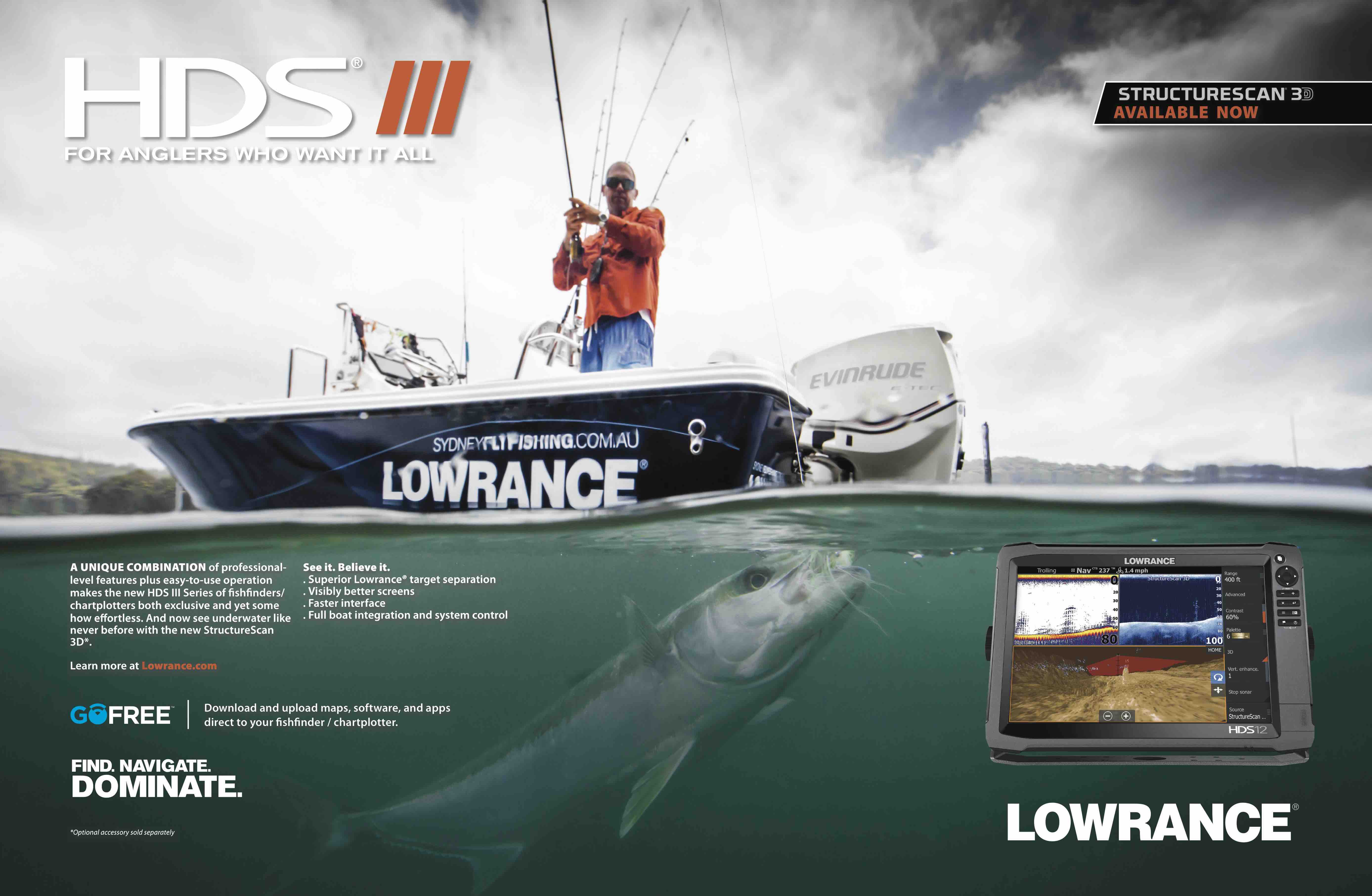
Image: Jack Murphy Fishing & Photography
- Honda add some mojo to their marketing
Honda took a boring old cardboard box and created a story for their outboard packaging. The image features some lads kitted out for an offshore adventure, trolling for tuna on the high seas. The creative carried all the way through to posters and banner ads. The purple skies and moody styling is a detour from the clichéd blue skies and flat seas usually featured in marine marketing, but it certainly works, drawing attention to the brand and the offer.
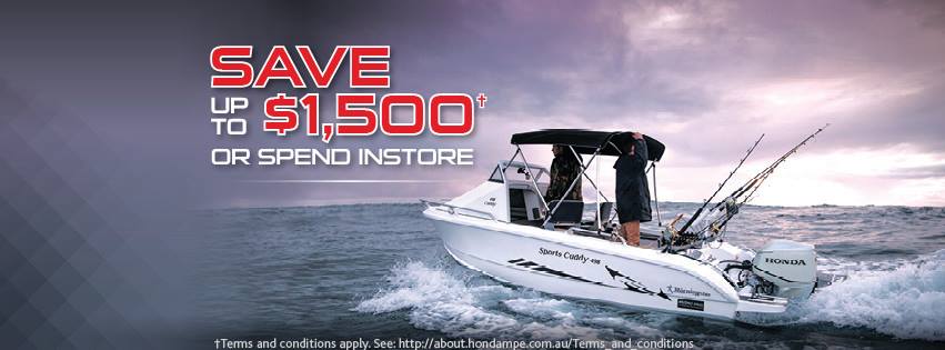
Image: Moby Dick Content
- Whittley sex it up
Whittley gave their FF2100 model a youthful voice with this cool creative. The imagery is authentic without compromising quality – and the brand name and distinctive Whittley shape is unmistakable. Nice design too – it’s full of information, without being too busy.
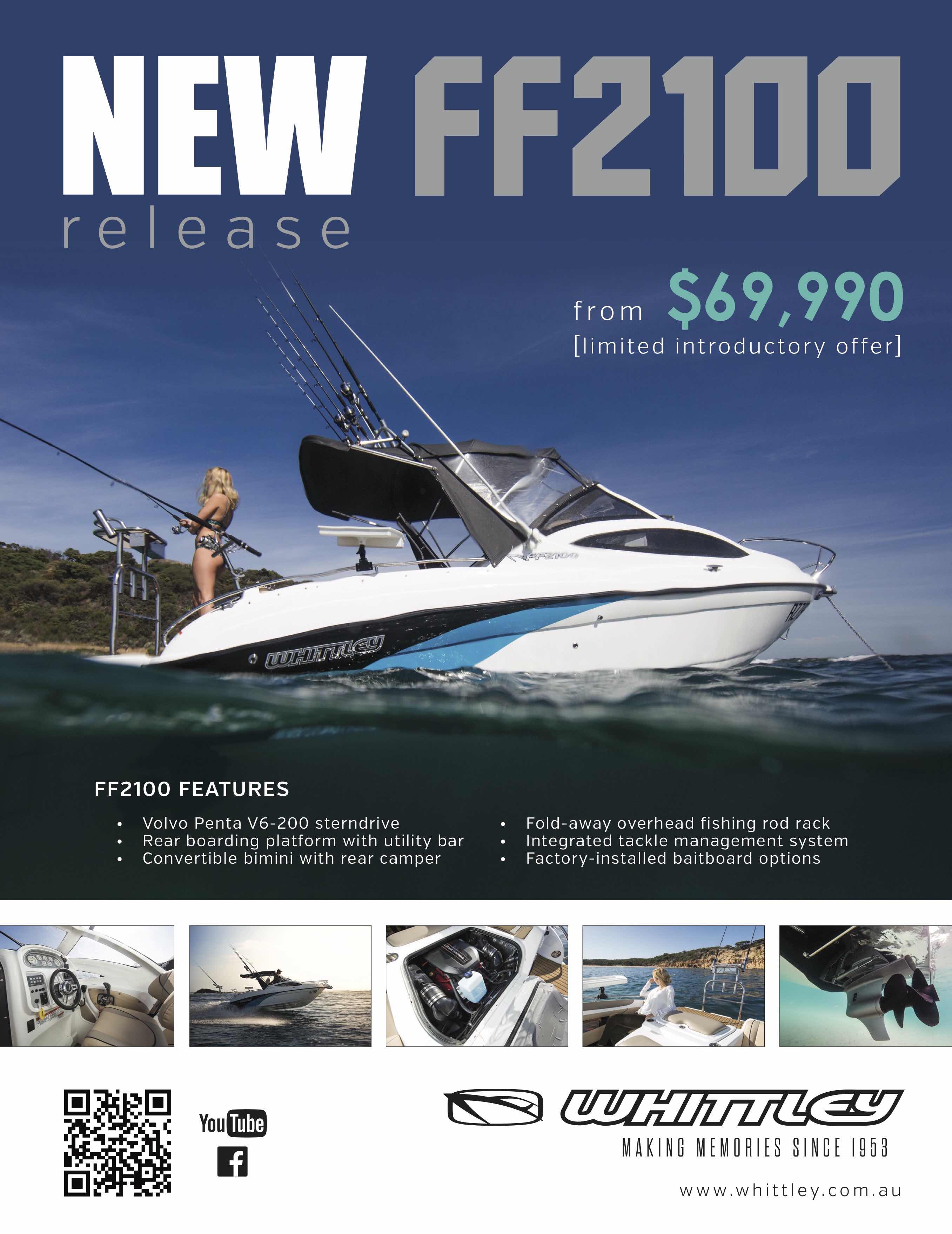
Image and design: Moby Dick Content
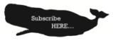
- The Captain’s subscription promotion on Facebook
Ok, we’re biased. But this image travelled far and wide, hitting over 10,000 eyeballs (20,000 assuming our audience have two eyes). The styling was off the cuff, using interesting objects found around the office. The result was a truck-load of subscriptions for The Captain! No expensive or lumbering advertising agency required!
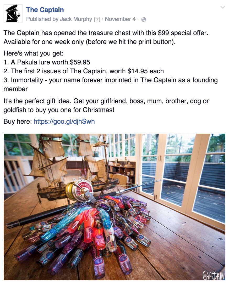
Image: The Captain
TIME TO WIN!
To celebrate the festive season, The Captain is giving away two tickets to In the Heart of the Sea – the famous tale of Moby Dick, the white whale. Just tell us in 25 words or less, what is your favourite corporate image and why. You can pick any corporate image, even yours! It could be an ad, or a Facebook post, or maybe some cool packaging.
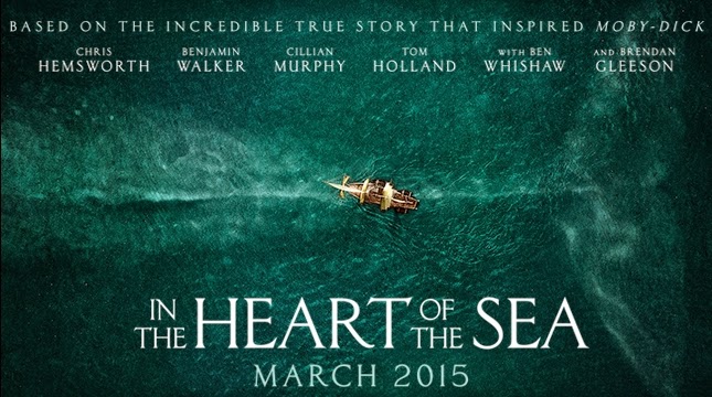
Get tapping and send in those photos – this movie is epic!